
Sensei Bar Menu
Project Type
Project Date
Project Management,
Menu Design, Print
2020
Project Description
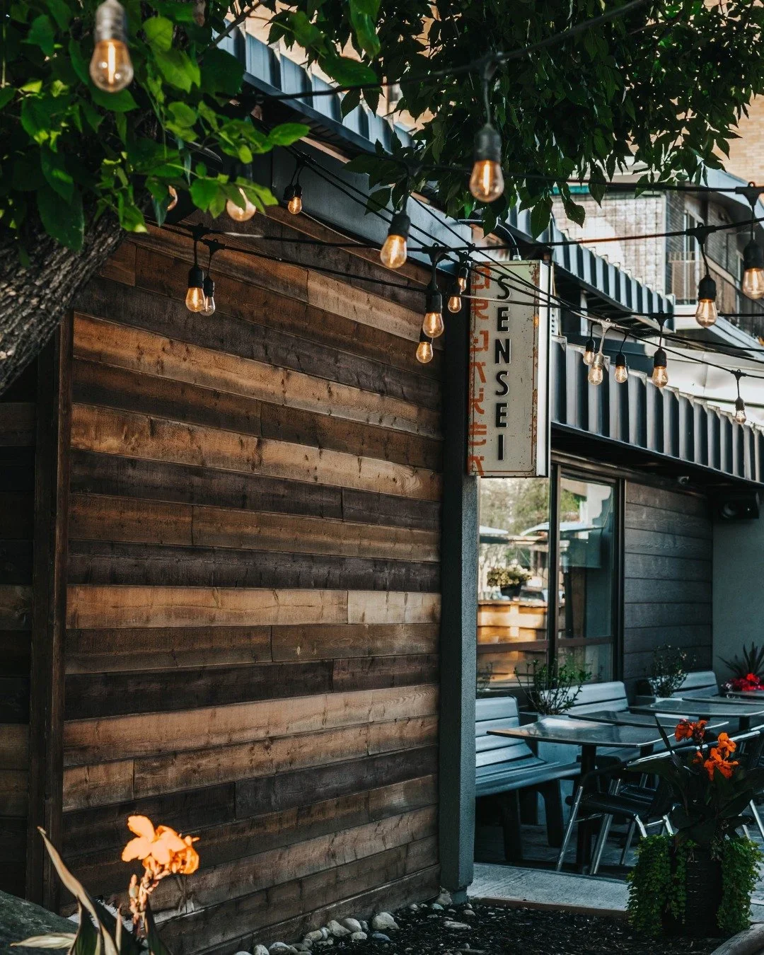
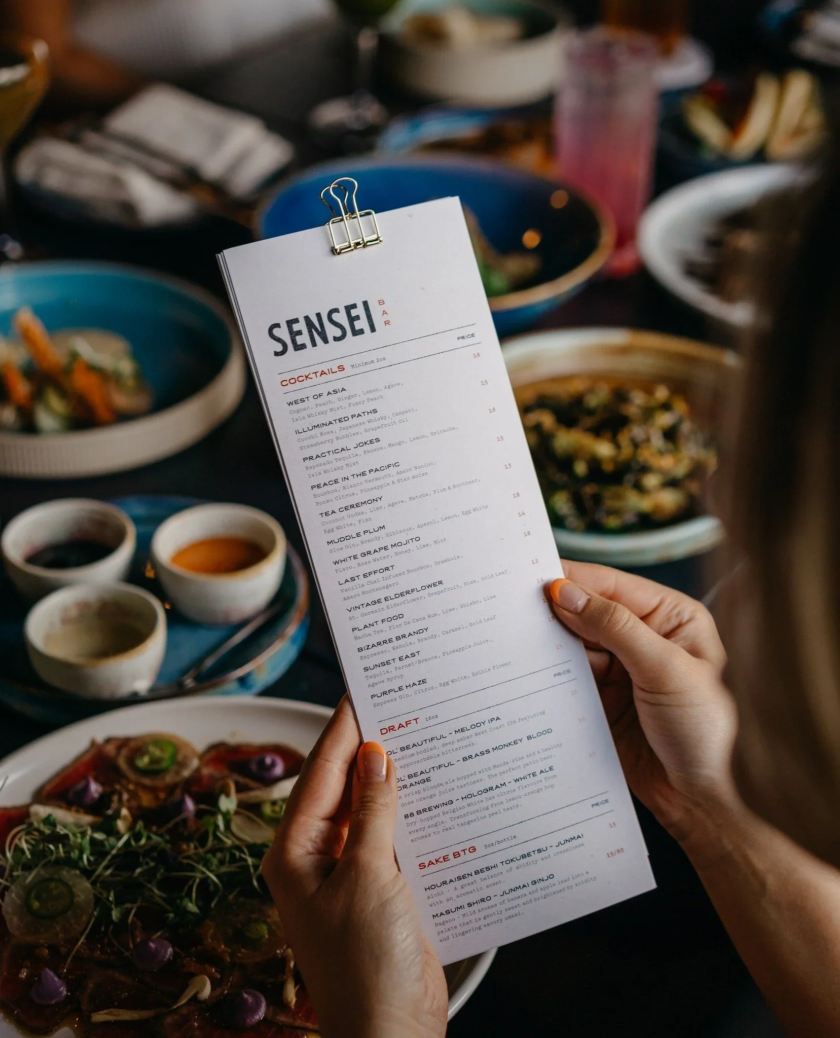
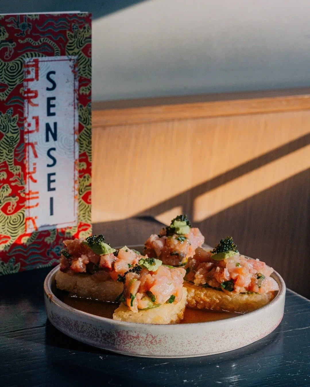
A fresh visual identity for one of Calgary’s standout culinary experiences.
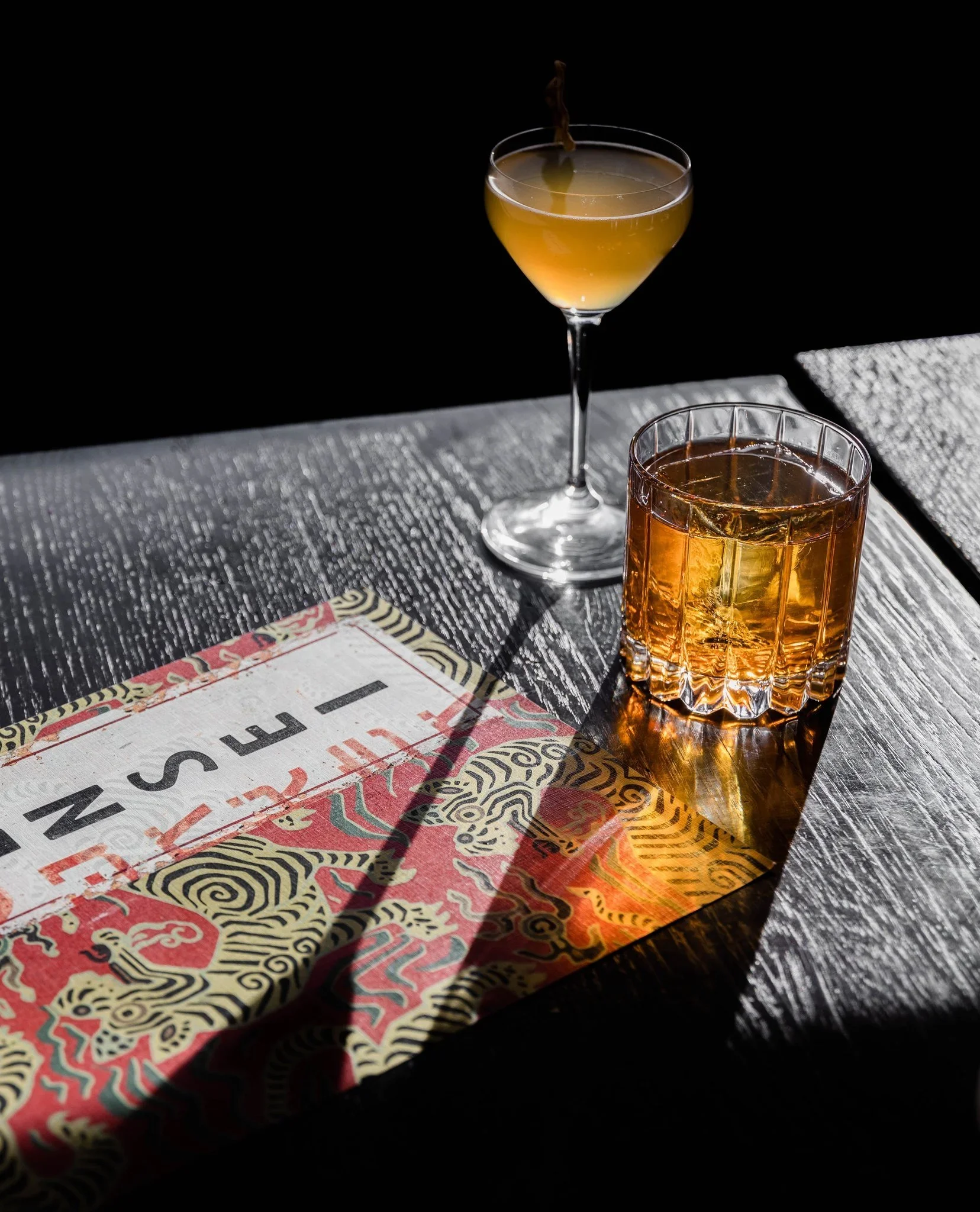
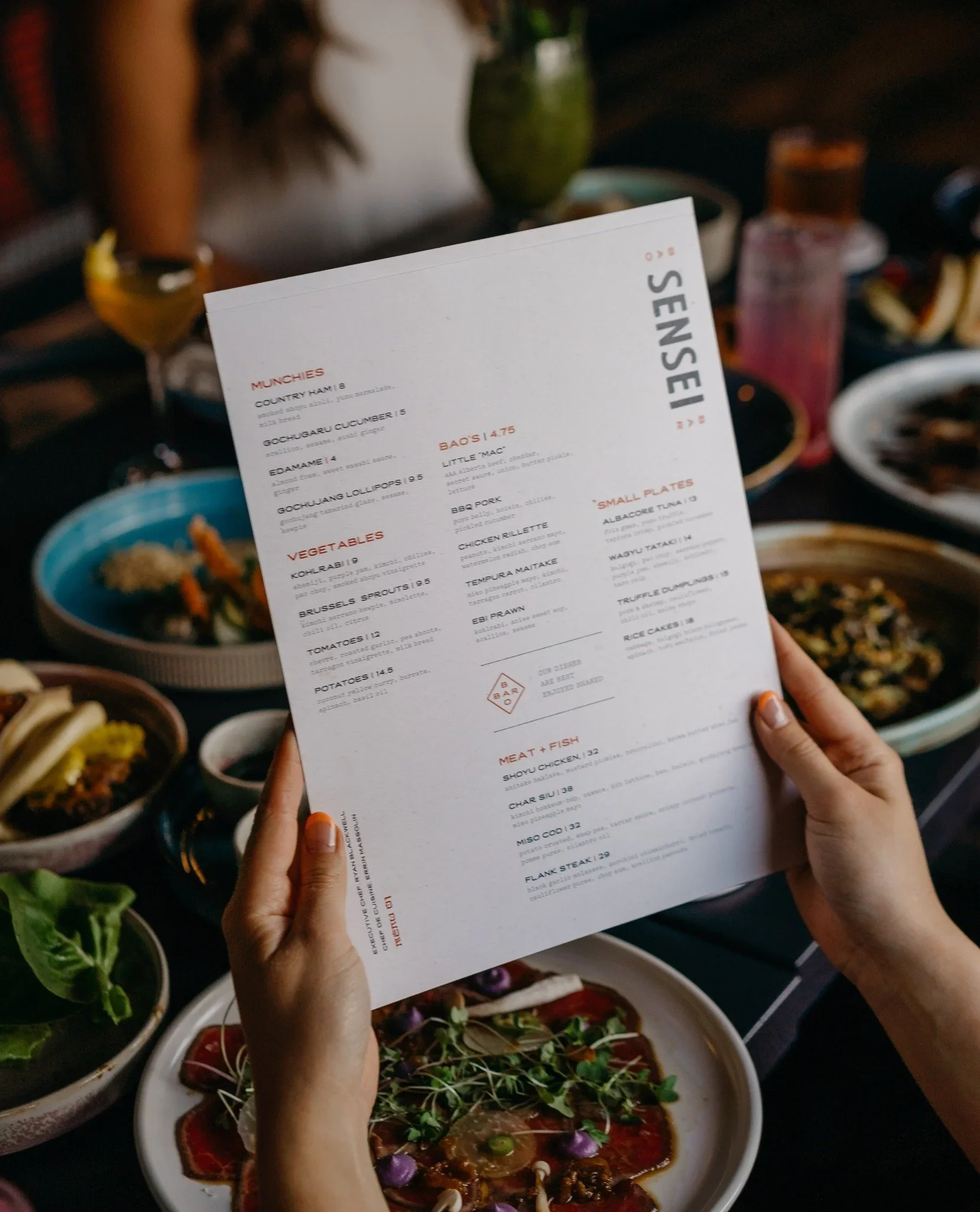
Sensei Bar’s menu redesign was a visual extension of the restaurant’s culinary identity—where Japanese inspiration meets French technique and Alberta’s local character. The concept focused on crafting a layout that balanced richness and clarity, using clean typographic hierarchy and intuitive pacing to support both shared dining and storytelling. This design bridges visual appeal with function, enhancing the guest experience and reflecting the creativity of the kitchen.
Project Brief
Designing and printing the magazine were the easiest parts of this entire process. I think most of the challenges were from collecting and finding artwork from each respective artist. With 20+ artists with a large body of work, it requires a lot of patience and coordination to get everything in, and actually usable. Often, the artworks would be low resolution or resulted in poorly printed colours, creating the need for a new iteration.
I ended up using a wide grid to create multiple opportunities to accommodate the wide array of artwork sizes.
Project Start
After a lot of back and worth with quotes and samples, we ended up going with a local printer with the team so they could pickup the copies in preparation for their gallery event in the Philippines.
In hindsight, if given a second chance, I wish we would’ve printed with Hemlock printing (Vancouver local) because their paper, binding and general production quality is quite outmatched. But with a higher quality book, comes a larger cost.
Final Product
Future Proofing
With additional time and budget, I would have liked to create custom napkins, custom branded art posters (instead of the NBA sports one being used), and supplementary images to show a customer what their food might look like since the restaurant was experimental with their dishes.