PLAYGRND
Project Type
Project Date
Logo Design & Graphics
2025
Project Description
This project explores how the conception for PLAYGRND’S Logo came to fruition. Additional graphics are also included.
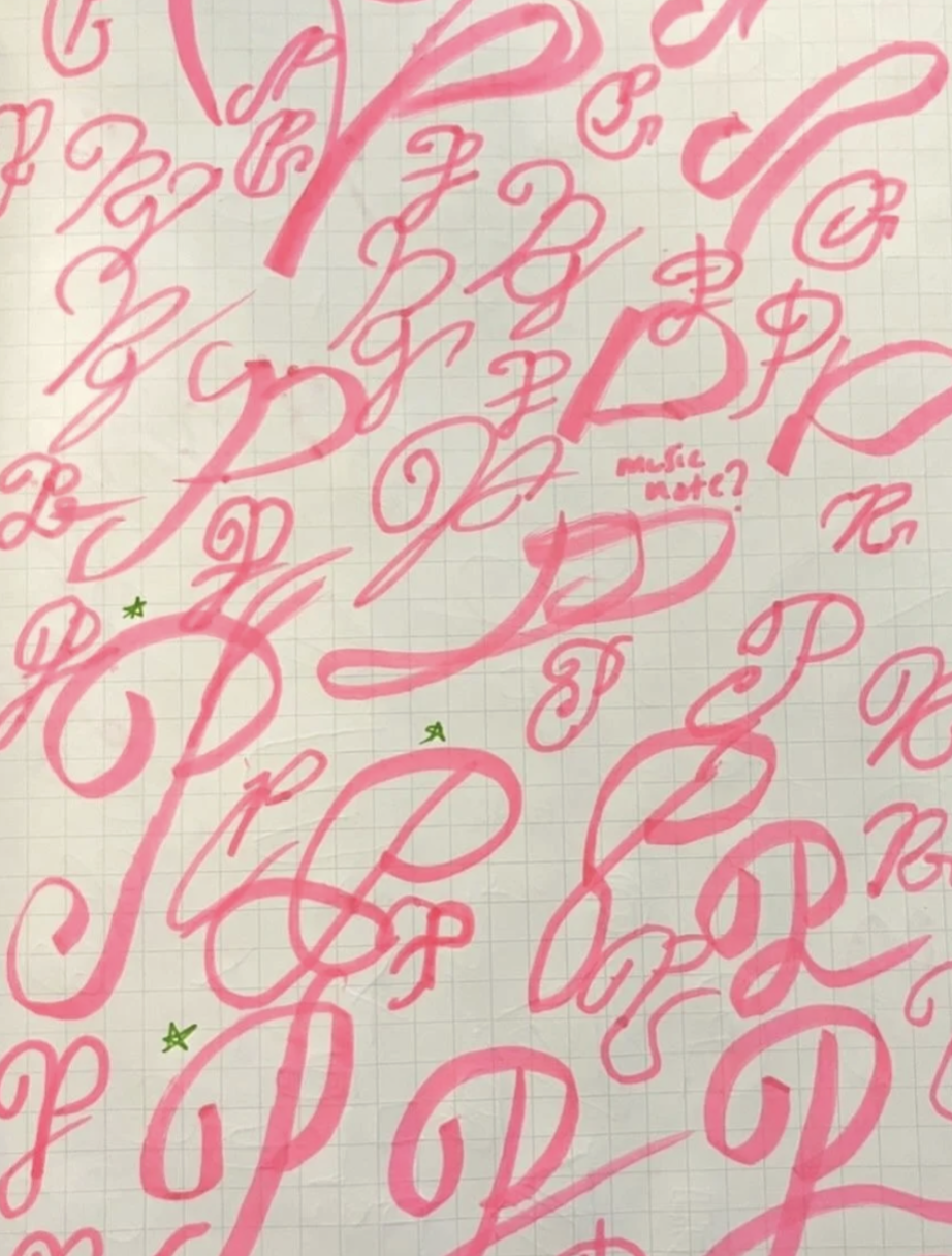
Logo Iterations
The Logo ideas started from script flows and Y2K-era typography. I even dived a bit into combining the P with music notations hinting at the brands industry. There were also explorations into a 4-letter mark and a full word mark, but they seemed either too formal or too unserious.
The initial conversations with the team outlined a growing concern for being too similar to existing event hosts in the industry. After locking in on a final mark, I gave some pushback with the final Chrome logo suggesting that even if it seemed sylistically similar, I think that their freshness and unique perspective would pair well with the visual flare of the logo.
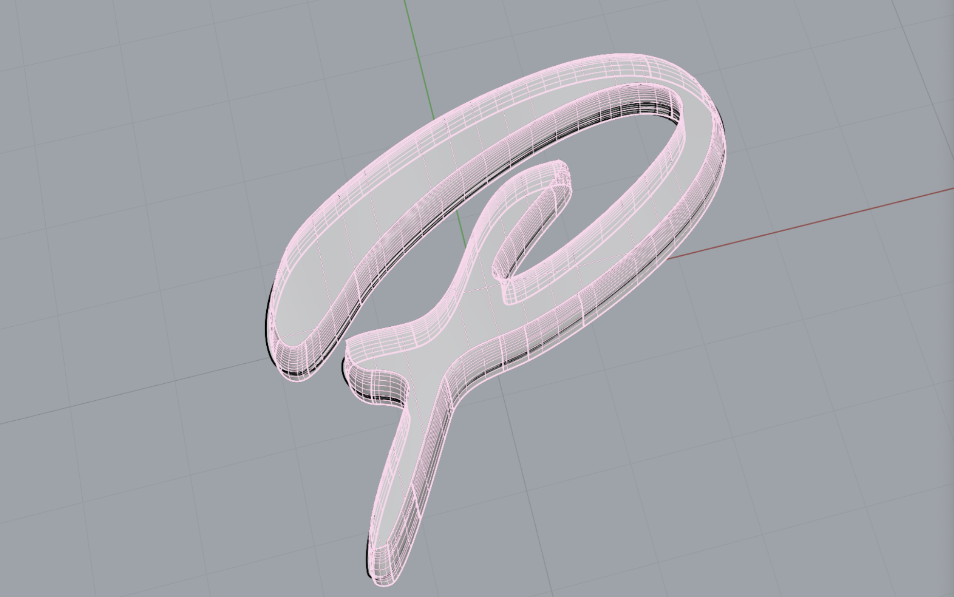
From the original script P marks, we landed on this mark because it resonated with being that middle ground between the old-style fun script P marks and a modern, fun and notable mark.

Final Logo
Additional Work
Project Description
Event posters & Social Media mockups

Logo Mockup on Social Media + Full Wordmark in Chrome

2025 Summer Tour Initial Design Iterations + Inspiration