Vancity CJ CNY Box
Project Type
Project Date
Graphic + Print Design
202
Project Description
Small take-home box for collectors to give to their friends and family throughout the holiday season.
The box is composed of three parts.
1. (left) The outter shell that covers the entire box.
2. (middle) This is the main box. It is slides in and out of the shell to reveal the gift cards.
3. (right) The sleeves for each card. These perfectly fit toploaded Pokemon cards for ultimate protection for each gift.

Box Print File
With 6 months in the making, this brand guide fully encompasses everything from slogans to social media text placement to even how not to use your logos.
Most of the work came from cross-collaborating and interviewing different key team members, providing valuable information on how to create a meaningful brand experience.
Due to the flexible project timeline, I was able to really dive in and create something not only for an external international audience, but also the internal people who make the product work.

Key Sections
Presentation Templates
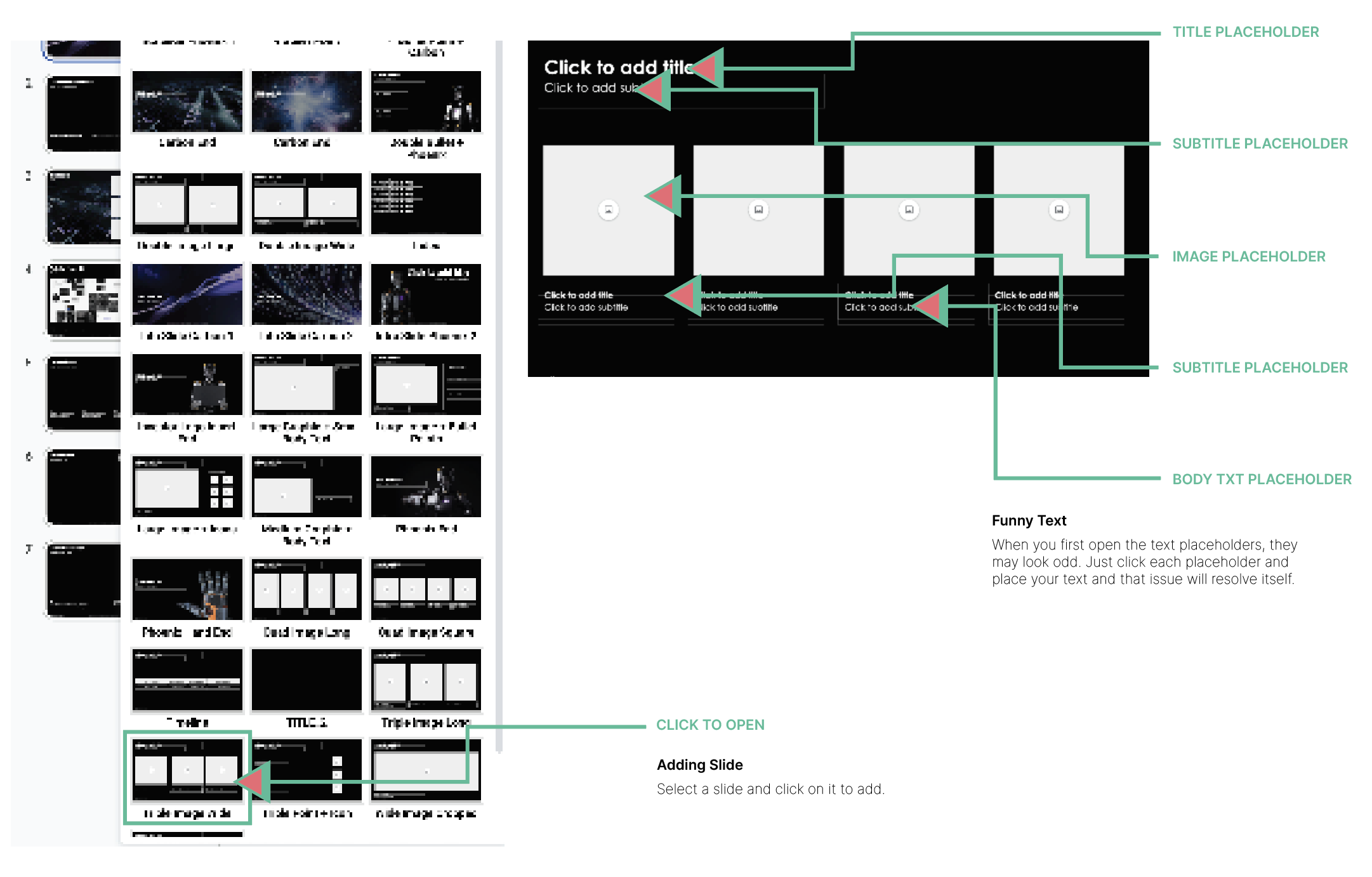
After some time with Sanctuary AI, I noticed that the employee presentations, pitch decks, guest presentations, spec presentations and all relevant slide information all looked like they were from different companies.
I went into each department and took note of all the formats they used and referenced it across the other areas. From there, I tried to find overlap and consolidate it into one cohesive and branded set of slide templates (the image is low resolution due to security reasons).
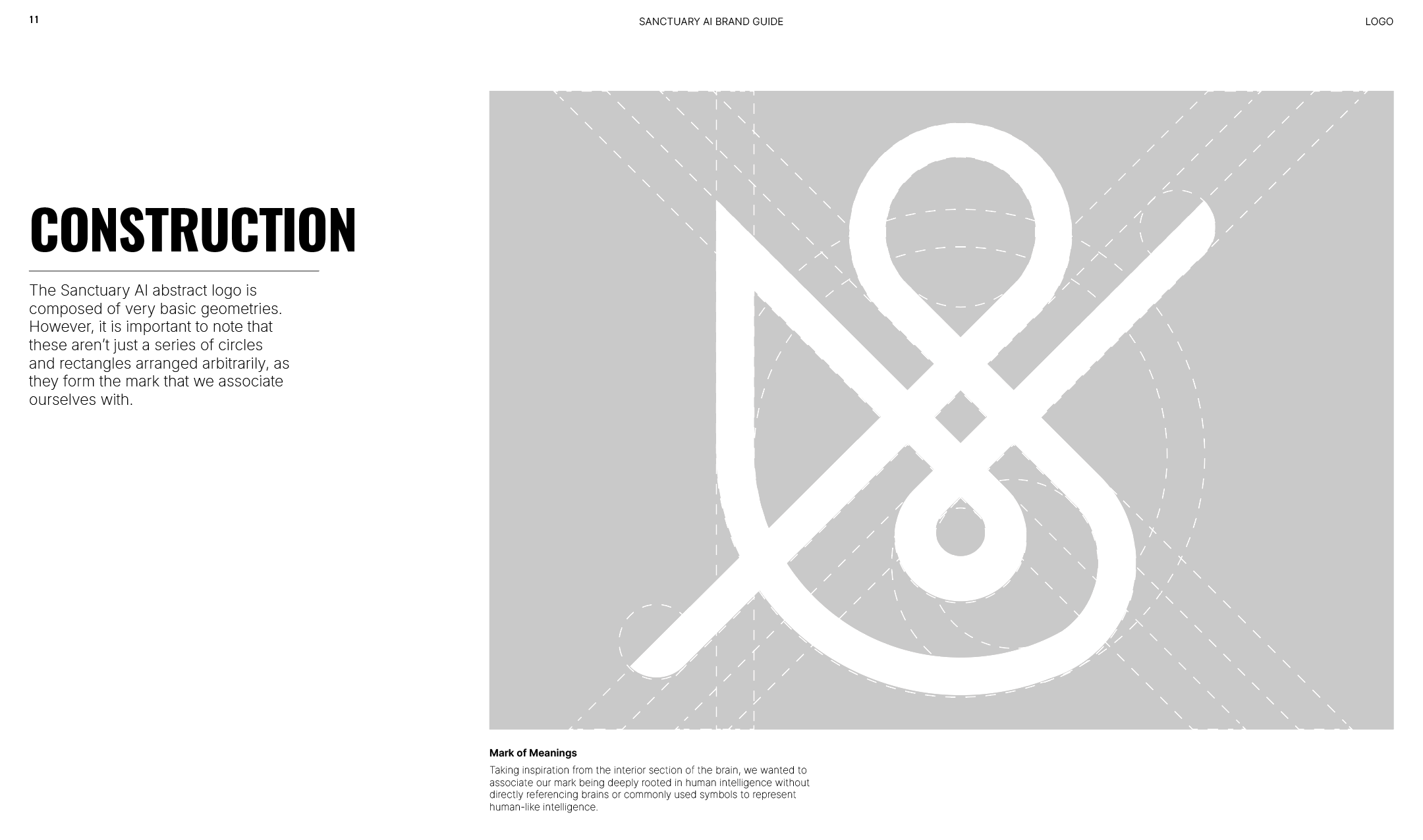
Logo Meaning
To my surprise, very few people internally knew the reasoning for why the logo looked the way it looked. Many guests who have crossed paths would also ask about the marks’ meanings and origins. I made sure to pool archive information into a graphic to give objective information on its formation.

Brand Colors
There was a bit of confusion in terms of brand colours internally. Previously, the use of color felt arbitrary across the entire organization. Since a color palette of colours across a line was almost redundant, I opted to skew the lines to bring priority to black and white being primary usage while the others were used as mere accents.
Sometimes, there would be too much orange or too much blue and the importance of documents or ideas would be buried by graphics that made unnecessary details distracting.


Clear Space
Generally, clear space isn’t universal language. Often, filling a document from edge to edge with information is a common practice for some industries. While this is fine in certain scenarios, like presenting something to a friend or close colleague, it might have a drastically different effect to a potential investor.
Giving your idea, or a logo, room to breathe can often elevate the presence, or at the very least, bring importance to it. The last thing we want is for other people to misinterpret what we are trying to say or show because there’s too much.

Website
Project Description
The entire website was built on Squarespace. Each section was made with custom blocks and additional injected custom code. The main goal was to simplify internal use compared to the previous CMS, Umbraco.

Site Architecture + Users/Pathings

Website News Page + Injected Code

Easy to Navigate CMS

Previous CMS (Umbraco)
-
![]()
Business Card Mockup
-
![]()
Website
-
![]()
Event Handout
-
![]()
Sanctuary Billboard
-
![]()
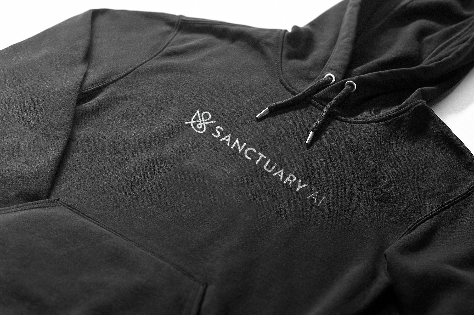
Branded Hoodie