
Vancity CJ Card Shop
Project Type
Web Design
2024
Project Description
Project Date
This project explores how Vancity CJ can improve the online shopping experience for Pokémon card collectors, players, and grading enthusiasts, with the goal of building trust, driving sales, and strengthening community engagement.
Design Research


High-Fidelity UI Design
Project Description
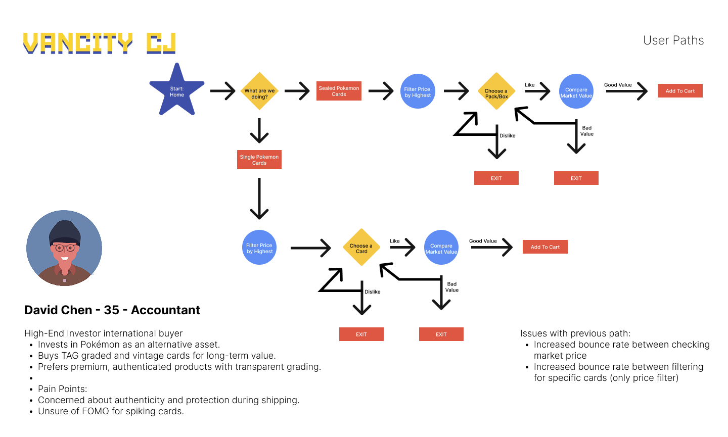
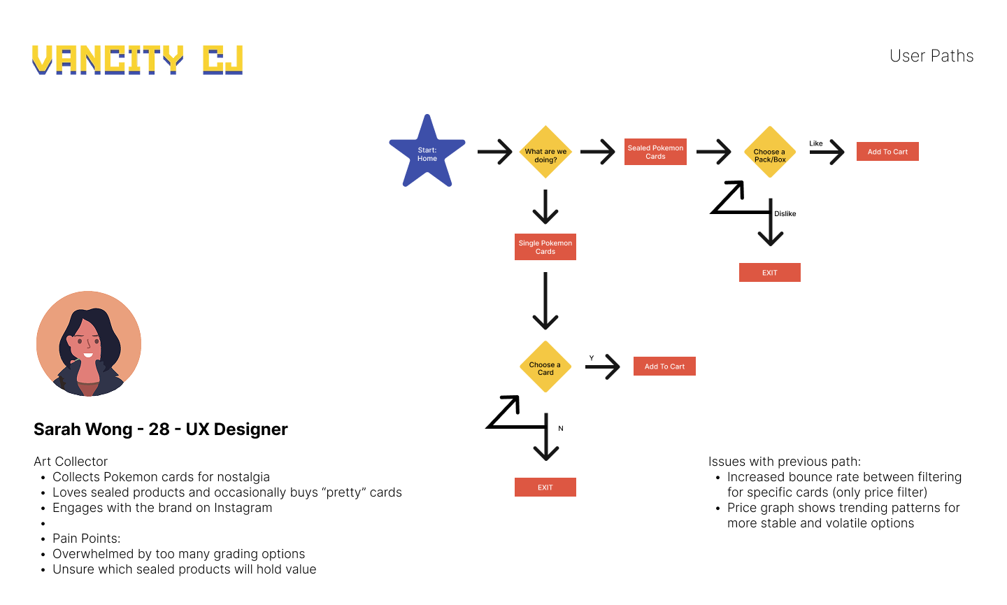
The mockup system included below focuses on optimizing the pathing for the different regular users, ensuring consistent and intuitive navigation across the shopping experience.

Main Home Page // Compared to the initial website, it had a lot of redundant information that confused users. Additionally, the hero images clashed with the text making it illegible and not the greatest first impression. This design focused on establishing a sense of authority in the card space while also hinting at clear next steps for a user.

Home Shop Page // I think a big pain point for card collectors is that they aren't always the most UX intuitive, so having 2-3 cards on the initial home page might result in assuming that is all that is available, where as 8-10 shows there is diversity and hints at more options regardless if there is a "view more" button or not.

Home Shop Page 2 // This section was fine, there was one redundant blade that also was a minor portion of the companies revenue and could just be included in the initial header menu. I created a new image for the SLABMAG section because the previous one showed how a sports card would look in their products, but they are selling Pokemon.

Home Events Page // The home page originally didn’t highlight events, but research showed Vancity CJ has 50–150 regulars at weekly tournaments. Adding a dedicated Events Page supports players with clear schedules and sign-ups, while also exposing collectors to the brand’s community side — potentially converting them into active participants.

Contact & Footer Section // The Initial contact section just had an email to copy and paste and without a dedicated form, it makes it more likely for a user to forget to open their email application and actually send an email. Without a button that directs a user to the top of the page, users would have to scroll back to the top to access things, so I added a menu and some additional buttons for more reach.

Card Shop Section // The initial card pages were divided into 6 tabs. So by consolidating them into sensible sections, I added a new initial gallery blade to show the different types of products per that section. That way, a user would only be shown relevant products for the specific section shown, as opposed to having to click every header option and find something potentially useless.

Shop Section // The Initial design had considerably small images of the products. It doesn't make sense for a user to spend hundreds to hundreds of thousands of dollars on an item they can't clearly see. Additionally, I added an increased filtering option allowing users to filter by the card set they are specifically searching for (collectors typically complete sets or know the set a card is from) as opposed to only being able to filter by monetary value.

Mockup Animation // A Figma screenshot showcasing my general thought process behind certain buttons and how they translate into the next section for a user.

Mobile Section // There were a few formatting issues when the original site was opened on the mobile view. Surprisingly, a large amount of new site visitors came from social media (100,000 - millions of views from instagram), so I made sure each section was as effective on the mobile view as it was on the desktop version.

Info Section // Initially, the website had three blades telling a user where there new shop was, but I think it could all be simplified into one page that tells a user everything they need to know for inquiries, questions, locations, etc. I also fixed their map as all the colours, low resolution and text still made visitors have to call the store multiple times as to where the shop exactly was.

Card Grading Section // The Initial page had a large block of text telling people how to do it. A majority of people have to grade the card in store because the online version was too confusing or they didn't trust it enough to risk mailing it in. I included diagrams showcasing the process because a new user would most certainly not understand the process and the visual difference between card grading options.

Originally, the shop originally focused only on graded singles, so I designed a system that lets users toggle between raw and graded options — with scalability in mind since the business already has thousands of raw cards in stock. I proposed integrating sales/population data into product pages, reducing the need for users to leave and verify prices elsewhere. Finally, I added an upsell opportunity for SLABMAGs, turning a missed touchpoint into a value-add that protects cards while increasing average order value.